

Is the World Getting Grayer?
An exploration of album and single covers

One of the most unique music newsletters is The Art of Cover Art, Rachel Cabitt’s monthly-ish exploration of cover art. Each time I read that newsletter, I think that it would be fun to do a quantitative analysis of cover art. The problem is that I never knew how. Until this week. So, let’s talk album and single covers.
If you enjoy this newsletter, consider ordering a copy of my debut book, Uncharted Territory: What Numbers Tell Us about the Biggest Hit Songs and Ourselves. It’s a data-driven history of popular music covering 1958 to 2025. We talk about the evolution of covers extensively in Chapter 7.
Is the World Getting Grayer?
By Chris Dalla Riva
Over the last few years, there’s been much press about how there’s less color in the world. In October 2020, for example, a group of British museums found that their artifacts become less colorful closer to the present.
Not long after, a person on Reddit posted a startling graphic that showed how car colors are now dominated by whites, silvers, blacks, and grays—a notable shift from the blues, reds, and greens that used to be common on the roads.

These graphics always had me wondering if album covers also followed this trend. Were popular artists ditching purples and yellows for whites and blacks when creating images to pair with their music? Sadly, I didn’t have a database of album covers. But I did have something close: a database of single covers.
I Swear Purple Hasn’t Died
As I mentioned at the top of this newsletter, I recently released a book called Uncharted Territory. It’s a data-driven history of popular music that I wrote as I spent years listening to every number one hit song in history. Along with collecting loads of information about all those songs, I also tracked down the artwork associated with each.
Here’s a brief excerpt from my book about the evolution of cover art:
Before Columbia Records hired Alex Steinweiss as its art director in 1938, albums did not have cover art. They were sold in generic packaging that labels could mass produce. Steinweiss realized that if an album were packaged with engaging art, it sold more copies. Other labels followed suit, and most albums since have been released with a front-facing image. The singles market was slower to adopt this visual counterpart, though … I spoke to both Joel Whitburn and Fred Bronson, two leading authorities on the Billboard charts, and they concurred that … single cover art wasn’t prevalent until the 1980s.
This often shocks people. Singles didn’t have artwork before 1980? Well, some did. But as I detail in the book, most singles were sold in generic packaging that just highlighted whatever label they were released on.
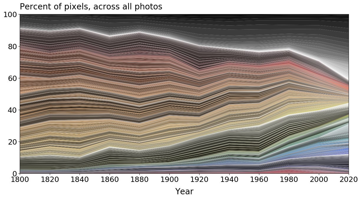
Even so, I do have a database of the cover art of 754 songs that topped the Billboard Hot 100 between 1960 to 2025. Given that there were at least 50 number ones with cover art from each decade, I thought we had a big enough of a sample to crunch some numbers. Here’s how I did it:
Scaled each cover to be the same size
Iterated over each pixel in each cover and identified the color
Stored a count of pixels by color for each cover
So, is color disappearing in music the same way it is in other parts of the world? No, not really. Sure, there’s a bit more black these days—17.2% in the 2020s as compared to 9.9% in the 1960s—but that change was mostly complete by the 1990s.
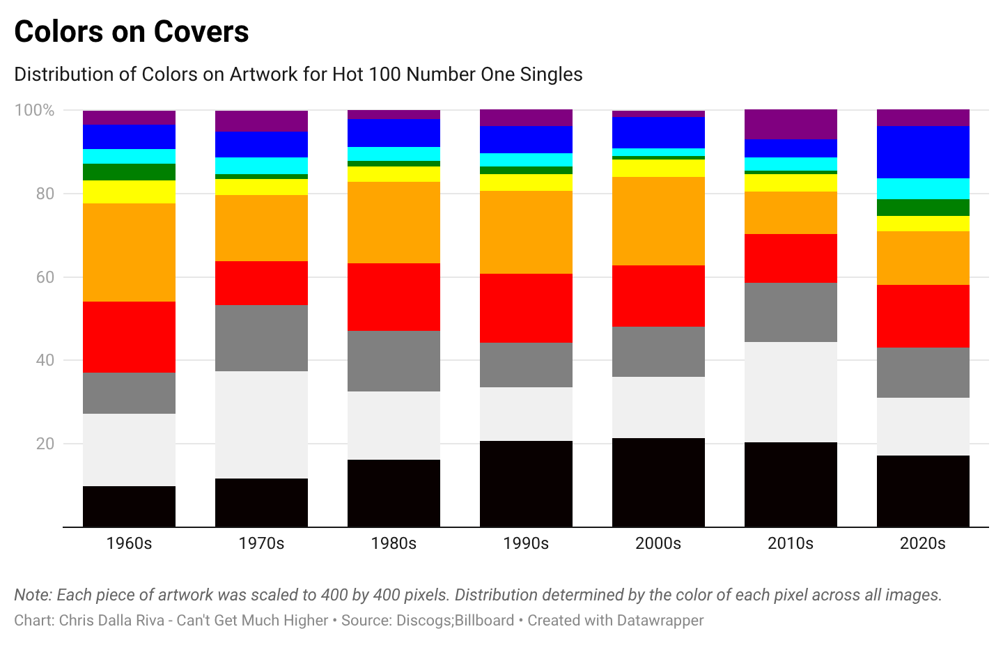
At the same time, if we just focus on the colors that seem to be disappearing in other studies—including red, orange, yellow, green, cyan, blue, and purple—they still seem to be around in the music world.
In the 1960s, 62% of single covers were composed of those colors. In the 2010s, that rate had fallen to 41%, but this decade it bumped back up to 57%. In other words, if you want to find a very purple cover of a hit song, you still don’t have to look that far.


Okay, so purple is still alive in the music world even if you can’t get a purple sedan anymore. That’s cool. But I would be misleading you if I said that nothing had changed in how musicians use color.
It’s Fuchsia, Not Pink
Let’s play a game. Take a look at the square below and tell me what color you would use to describe it.

Nice. You’re doing great. Let’s play another round of this riveting game. Look at the square below and tell me what color you would use to describe it.

If your two answers were “red,” then I would give you a first-place trophy. If you said “scarlet” and “Spanish red,” I would also give you a first-place trophy, along with asking how you got access to my Google search history.
Jokes aside, my point is that color is complicated. There are lots of colors that we call “red.” There are just as many that we call “green” and “blue” and “yellow.” My original analysis didn’t account for this. I was looking at color—or hue—in a very broad sense. But we can look at a few other metrics to understand how covers have changed.
Less Faces, More Vibes
While color intensity has largely been unchanged (e.g., your greens are just as green), colors on single covers since 2010 are about 9% less bright than those in the 1960s and 1970s—a statistically significant difference. I believe this shift makes sense when you recall—as noted in my book—that popular music in the 2010s became sadder.
Covers are also much less likely to feature a picture or illustration of the performing artist these days. Among number one hits that had a cover image in the 1960s and 1970s, 83% featured the likeness of the performing artist. Since 2010, only 63% have.
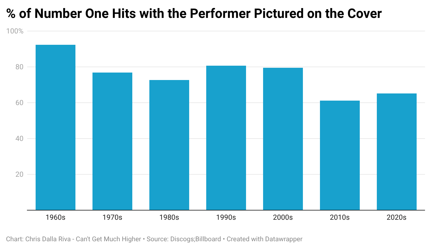
I believe this is connected to how prevalent images have become in our society. In 1964, if you missed Frankie Valli performing on some variety show, and he didn’t recently make the news, it wouldn’t be that easy to figure out what he looked like. A cover was the perfect way to connect his face to his music.
Today, this isn’t an issue. If you want to know what Doja Cat looks like, you can pull up her face on your phone in 15 seconds. You don’t need her latest single to communicate that to you.
This brings us to a related final point. Single covers are less “busy.” (“Busy” is my imprecise word to capture some combination of Shannon entropy and Canny edge detection. The specifics don’t matter for this discussion.)
Back in the day, a single cover would often have a picture of the artist, the name of the song, the label’s logo, and maybe some blocks of color. You can see some examples below.


As noted, the goal of a single cover is very different today than it was a few decades ago. I don’t need to see a picture of Post Malone on the cover of his single because (a) there are a million ways to see what he looks like and (b) covers are often relegated to tiny thumbnails on streaming services. That second point also suggests why you don’t need your song title on the cover. The title is likely listed elsewhere on whatever device the person is listening on.
Because of this, single covers are frequently dominated by dim, fuzzy scenes that communicate a vibe more than any information about the artist. You can see this in some examples below.


In summary, musical cover images are different than they were a few decades ago, but that is not because they lack color. Color is alive and well. But why has color remained alive and well in the music world while it seems to be disappearing elsewhere?
First, it’s not expensive to produce cover art with or without color. Cost can’t hinder the usage of color in this world. Second, if you’re a musician, you probably have some affinity for the visual arts too. There are visual artists who stick to blacks and whites, but most will want to engage with the different parts of the rainbow during their careers.
In a world that seems to be becoming duller, I think it is time for Ford to hire “drivers license” singer Olivia Rodrigo to help design their next pick-up truck. A little color might go a long way in these tumultuous times.

A New One
"Dodge" by Baby Nova
2025 - Singer-Songwriter
Baby Nova’s debut album Shhugar picks up where the Lana Del Rey discography has left off, the young singer-songwriter conjuring moody emotions about heartbreak over acoustic instrumentation. The cover of the album not only matches that vibe, but it fits perfectly within the current age—the singer pictured on the cover amid a darkly-toned kitchen, neither her name nor the record’s title anywhere to be found.
Where some of her lyrics on this record feel like they ramble aimlessly, “Dodge” feels more precise. “Gonna take more than a Chevy to get me out of Dodge / Gonna take more than a rifle for me to get a shot,” the Nova Scotian singer almost whispers on the track. It’s those bits of wordplay that keep me coming back.
An Old One
"Darn That Dream" by Bill Evans
1962 - Cool Jazz
Each time I return to Bill Evans’ album Undercurrent, I’m struck by the cover image. It’s a sepia-soaked photograph taken underwater of a woman in a dress, her head just barely peeking above the surface. A stunning image, it feels out of time. In fact, it has the feel of an image you’d see on a single or album in 2022 rather than 1962. It works, though. The image pairs well with the wistful interplay between Bill Evans’ piano and Jim Hall’s guitar.
If you enjoyed this piece, consider ordering my book Uncharted Territory: What Numbers Tell Us about the Biggest Hit Songs and Ourselves. The book chronicles how I listened to every number one hit in history and used what I learned during the journey to write a data-driven history of popular music from 1958 through today.
Chris!! I'm honored 😭 This is such a cool take on album and single art. So cool to know the stats on portrait album art. Thank you for doing this.
Here are another couple factors which might come into play, when it comes to album/single cover art:
1) There are far fewer artists these days that have the benefit of a record label's Art Department (or whoever firms they contracted such visuals out to, under their supervision), where professional aesthetic expertise mingled with marketing/focus-group data. Such entities were also the keepers of "house style", where there was such; especially in the indie 80s and 90s. As a result, artists have to do this stuff themselves; or pay (very) dearly to have it done. This makes for hard choices, optimized for maximum impact.
2) The cottage industry of music-marketing advisers (here + elsewhere) shriek ceaselessly at air-raid siren volume about the absolute necessity of maximally appealing, arresting, impactful cover art; to the point that it's nearly more important than the music. Visual media (ig, FB, YT, whatever) demands nothing less than that, or your whole project is sunk before it launches.
Which is fine/ok advice on an individual basis, but...in aggregate, cover art becomes yet another "arms race" spiraling upward, or so it seems. And because of the long odds against new/medium-sized + below artists as things are, the race is not optional. And, as always, you're not just competing vs. peers; but against Every Great Band's Immortal Imagery (that was made with professional help, + lionized in print + elsewhere, over decades since). So color is inevitably gonna be a max-use weapon in that struggle (especially in teeny-tiny thumbnails).